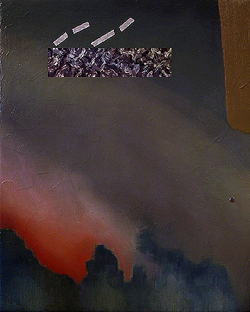
Fire Break, 16" x 13", oil on canvas, 1996. Artist's collection.
I believe that there are paintings here at FryeWorks which represent periods in my career when I was completely invigorated by the process of creating art--Space Chase and Saint Helices 65 and 66 come to mind as examples of that peak level of energy. In contrast, this painting's execution was more like a long meditation that went on for many days. I do love this painting and the painting and I have spent many evenings staring each other down.
The composition began intuitively with the atmospheric blue-green hued elements as seen here, but were monochromatic black and white at the beginning. At that point I was turning the canvas in all directions. Then I applied a blue and yellow scheme of overlapping glazes leaving some areas blue, some yellow, and some areas a green mixture of the two. Then I painted the red-orange area to contrast the previously applied color scheme. Then came the thickly-applied opaque stroke of yellow ocher in what is now the upper right corner. At this point I am still turning the canvas around, viewing the composition at different horizontal and vertical positions. I decided on the vertical orientation that carried some resemblance to a high-angle view of a stand of trees surrounding what appears to be a fire.
This is where the staring matches began and the elements I applied to the canvas from here on were deliberated, measured, and positioned like moves in a chess match. There was a large swath of atmosphere running diagonally across the canvas. I decided to place an object/portal in the atmospheric area. I measured and masked out the area and painted a passage of abstract expressionist brushwork. Fine. Now there is the issue of the atmospheric swath flying off the picture plane at the lower right. As a block, I glued a small 1/4" circular piece of plastic reflective material in the *exact* and most effective location. Now the parallel orientation of the top of the picture plane and the top of the object/portal seems too repetitive. I am not sure how to rectify this situation, so instead of painting in the correction, I applied pieces of 1/4" masking tape as a test for the correction. It worked and I was so nervous about recreating what the tape had done, the tape remains on the canvas to this day. Lastly, I glazed passages of reflected color highlights on the portal/object denoting reflected yellow light from the yellow brushstroke on the right, blue through the center denoting the "tree line", and a red passage on the left of the object/portal denoting the reflected color of the red passage at lower left. The object/portal absorbs and reflects the color scheme of the entire composition, as well as participating as an integral compositional element. The little mirror absorbs and reflects what is happening outside of the picture plane, as well as participating as an integral compositional element.